
Inflation Panic
Monday 24 January 2022


Growth of wind, solar, and storage is starting to place pressure on US natural gas consumption. It was inevitable that renewables would eventually come for natural gas in the same way natural gas, and then renewables, came for US coal growth—eventually killing coal’s future. This latest tipping point was easy to predict, but difficult to time. According to the EIA however, the moment has now arrived. Market share trends are about to flip, in their view, with natural gas in power generation due to fall from a 37% share in 2021 to a 34% share in 2023. Non-hydro renewables meanwhile will take market share in the same period, from 13% to 17%. Something to think about: this trend change will free up even more US natural gas for export.

US natural gas exports reached an all time high in December, maxing out existing LNG capacity. Some background to this story is in order. For many years, the only conduits to the export of North American natural gas were by pipeline to Mexico, and a single LNG export facility on the Kenai peninsula, Alaska. After the tight oil and fracking revolution began to pay out (after years of heavy investment) pressure began to build on Washington to develop, or rather permit, new LNG export capacity in the lower 48. That question fell to the Obama administration, which unbeknownst to its many critics, was about to oversee the largest expansion of domestic energy production in half a century. When Obama declared an all-of-the above strategy as his primary energy policy, more should have taken him seriously. It would have been easy, for example, for his administration to throw a regulatory submarine net over the entire oil and gas industry. Well, that simply never happened.
In 2014 the second term Obama administration kicked off LNG export capacity with several approvals, and a sequence of further approvals and eventual exports followed, with a lag time of course taken up by actual construction. And by the time he left office, approved LNG capacity (some built and operating, others to be constructed) represented roughly 15% of actual US natural gas production. This was the cornerstone of further approvals under the Trump administration, and how the US was able to export a whopping 12.2 bcf/per day of LNG last month, December 2021. Looking back, Obama’s critics would have had you believe he was a Bill McKibben president, shutting down oil and gas production, and fighting pipelines. As I commented back in 2016 during the administration’s final months:
That LNG export figure of 12.2 bcf/day now represents roughly 13% of production, currently running at around 95.0 bcf/day. Note how the export share keeps traveling along that 15% envelope—LNG exports have expanded greatly, but so has domestic natural gas production! Here is a good chart from EIA covering the growth of LNG capacity, when it came online, and the current forecast. According to the EIA, US LNG capacity will be the world’s largest by the end of this year.

Further reading:
Bordoff (2016) If you build it will they come? (PDF). | The Gregor Letter (2021): Supply Lines 1. | Gerdes (2021): US LNG exports are backfiring on the US oil and gas industry.
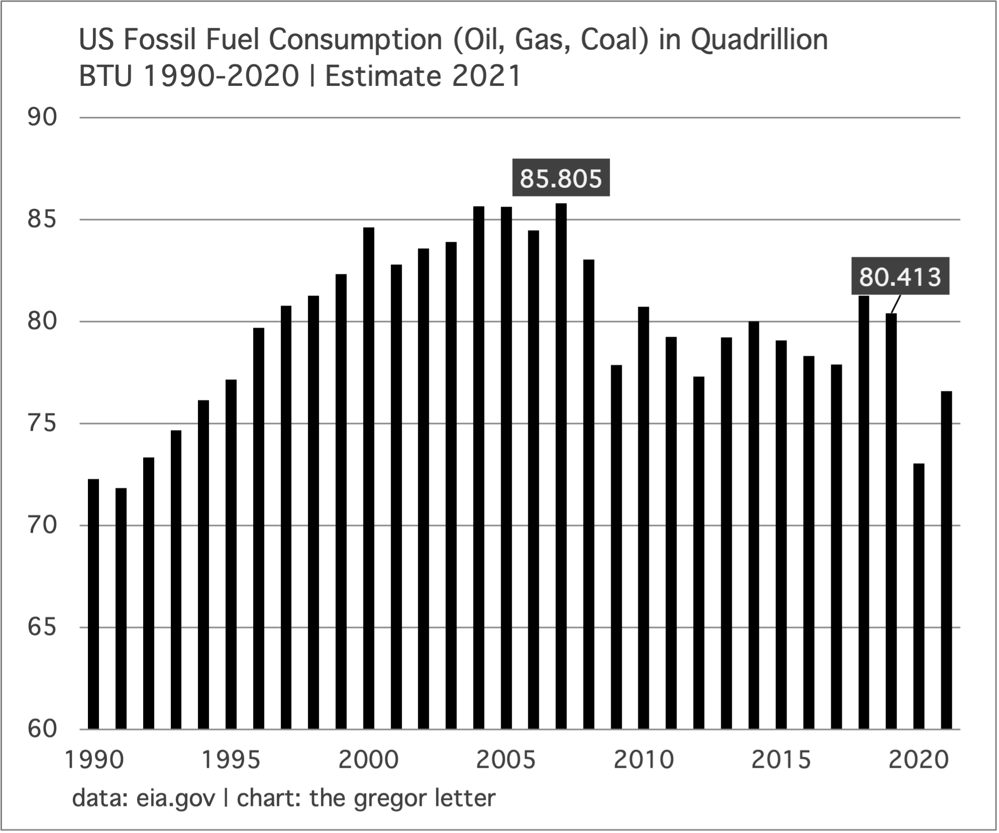
Total fossil fuel consumption in the US peaked in 2007 but saw a brief rebound— a spike really, in 2018 and 2019—largely due to natural gas. That the United States has made “pretty good” progress in transitioning away from fossil fuels often draws mixed reactions. Some, certain that the US is a kind of recalcitrant teen in this regard, find it challenging to their view for example that, yes, emissions peaked in the country fifteen years ago (the same year fossil fuel consumption peaked, of course, in 2007). Many educated people who are not experts in this area are often incredulous about this fact, some even certain it cannot be the case. Others meanwhile admit this progress, but say we are not doing enough to lead the world much faster, through decarbonization. OK, that’s true. The US should be thought of as a leader on climate and energy transition, but a kind of weak leader. We could be doubling our efforts without much if any pain. For example, taking energy emissions down steadily from over 6000 MMT (million metric) tons in 2007 to an estimated 4870 MMT last year is a solid performance, especially given 10% population growth, 300 to 330 million, during that time. It’s also very encouraging that the trend is so clear and well established.

But there are two major disappointments in this performance. The topline decline of nearly 20% represents an annual decline rate barely over 1.00%. And even that rate is not safe, because 2021 emissions were still clearly held back by the ongoing dampening effects of the pandemic, especially on miles driven and oil consumption. But the biggest concern is that petroleum’s share of emissions is now increasing. The Gregor Letter has been beating this drum for some time now: the US is not doing much if anything about its oil consumption, other than holding it to an interminably long plateau. Because decarbonization in the power sector has come along so quickly (and is now clearly accelerating) it has exposed this failure. The petroleum share of US energy emissions stood at 41.2% in 2010. Last year? 45%.
Looking at the bigger picture, total fossil fuel consumption in the US has a very nice arc to it. If we make a reasonable assumption that the natural gas led spikes of 2018 and 2019 will now be countered by renewables (per the EIA forecast discussed at the top of today’s letter), total US fossil fuel consumption appears to be on track to reach levels last seen in 1990 by, say, 2025. But The Gregor Letter is compelled to forecast that this trend is not safe, not assured, and may very well not adhere to the current trajectory because of the ongoing, petroleum policy failure.
The history of photography roughly spans the same period as the fossil fuel age. We are rich therefore in evidence of global warming’s progress, and the destruction it has already delivered. Below is from a series documenting the retreat of glaciers at Svalbard, by Christian Aslund. The full series is here.

The inflation panic has been a sight to behold, and like all panics it feels real to those ensnared by its emotional swirl. There was perhaps no more important or embraced theory during the decade after the great recession than the imperative to let the economy run hotter after a crisis, leaving the inflation fight (if necessary) to come second place in the policy sequence. Research was fairly definitive on this question: data showed that direct fiscal help to the economy was always too little, and that the Fed serially nipped off recoveries too soon, which left lower wage employment and especially Black workers stranded. Prior to this theoretical shift, the commonly accepted notion was that “the Fed takes away the punchbowl just as the party gets going.” But last decade, the consensus formed that this tendency was not a badge of honor, but rather an outright mistake.
The pandemic provided the opportunity to apply this theory in a kind of natural experiment. If anyone thought the double-barreled response of super-sized fiscal and monetary intervention would not create any inflation, they were simply not paying attention to a decade-long evolution in theory. So, setting aside the bad-faith voices whose only concern is political partisanship, all the advocates of trying a different approach knew full well it would at least trigger a significant, inflationary impulse. And the risk-reward proposition of this was understood to be solidly beneficial. Instead of a lost decade, we’d get back to full employment as quickly as possible. The faster resurrection of normal life for 330 million Americans would not just outweigh, but wildly outweigh inflation risks. And that is precisely how it turned out, precisely how it happened, and the theory was proven: this has been one of the most successful policies enacted since FDR’s programs in the 1930’s Oh, and by the way, did those recoveries in the 1930’s generate some inflation? They sure as hell did.
The above chart comes from a new economics newsletter, Full Stack Economics, and their long post, 18 Charts That Explain the US Economy. The chart can be grabbed from many sources right now, but it’s nicely paired with other pandemic period data that may interest readers. Here’s where things get interesting: Americans are not exactly happy about the current situation, and the media is only too happy to oblige these feelings with a lot of pumped up panic about inflation, Fed hawkishness, and the idea that we’ve created a mess, rather than a recovery. Don’t know about you, but all such noise sounds highly irrational. Let’s look at some high level journalists whose remit is to cover the economy who’ve now allowed themselves to get entirely swept away by the high inflation prints of November and December.

The intriguing admission here from Brian is that he doesn’t usually fall into the trap of making predictions, but apparently he just can’t resist doing so this time. Gone is any sense that inflation might have peaked late in Q4 2021. But just to counter the main assertion: the Fed did no such thing at the last meeting to confirm that it was raising rates at the March meeting. Powell quite clearly laid out a sequence in his press conference: taper first, then rate hikes, then balance sheet adjustment. Could the Fed raise rates in March? Of course they could. But the entire business media complex has moved however to the view that the Fed expressly said it’s raising rates in March. Again, they’ve said no such thing.


Tim Duy, who is without question one of the best observers of Fed policy, and who deploys subtle, nuanced language to explain the interactions between the economy and policy far better than most, has also fallen into the hole. When you see otherwise measured analysts (who consistently write at a very high level) lurching to this type of retort, it bears taking notice. Because even the best of us can be caught up in the passions of the moment.
Here is the risk one must always watch out for, when cannonballing yourself into the crowd in the swimming pool: the March FOMC meeting is a full two months away, and already the macroeconomic data is deteriorating. The US economy is currently slowing down, with a consumer retrenchment that unsurprisingly comes from having already brought forward a huge volume of consumption, and, which has finally been beaten back by prices. In other words, inflation adheres to the old adage that the cure for high prices is high prices. And unless you are a failed state, one without supply chains to even repair, and which exists in a dysfunctional condition over long periods of time, then inflation today should conform to the supertrend of the past 20-30 years. And that trend is not up. It’s down.
Now, what appears to be driving this panic is not that the expected inflation from a newish fiscal and monetary policy arrived, but that it arrived later and hit a higher level than even Team Transitory expected. And it’s weird, frankly, to see Larry Summers taking victory laps when the nature of the inflation that arrived did not even conform to his forecast, and to equally see Paul Krugman offering apologies, simply because inflation arrived later, and went higher than he forecast.
If you look at the inflation data for 2021, one simple pattern becomes clear: inflation didn’t move much in 2020, or even as we built back job gains. Rather, inflation finally spiked when the economy made its first attempt at a full reopening last summer. Compare the data chart below of US CPI with the fast employment recovery chart which starts this essay: the massive restoration of jobs didn’t trigger inflation for over a year. It’s not until the summer, prior to both the delta and the omicron variants, that inflation starts to break out.

The belief that inflation is “sticky” is even more problematic when you consider the actual, statistical components of inflation. It is mostly the car complex, both new and used, and the energy complex, oil and gas. Indeed, here is a very good post on how the entire car complex from car sales to gasoline is a very heavy influence on the CPI. But again, these statistical insights can be obtained anywhere. The car complex is already easing. It’s not just plausible, but likely that inflation goes into decline now in 2022.
What’s particularly frustrating about this moment is that a necessary and intriguing discussion about the pandemic itself and its unique characteristics has been shoved aside. Readers may recall the pandemic began with a kick-off of important research about the nature of plagues, and their long term effect on inflation, labor availability, and the economy. This thread by economist Sanjay Singh is worth recalling, and the paper it cites is worth reading. I also added a recent thread to the conversation: as you read through, please take careful note of the essay by TS Lombard’s Dario Perkins.
In the last letter, I explained there’s a whole tribe of financial market traders who are eager and excited to exploit the Fed’s propensity to make a policy error. They are not incorrect, for they see the Greek tragedy playing out to script already as the Fed finds its resolve to hike rates at the exact moment the economy is already slowing. But this time they may be rebuffed. We’ve got two CPI reports, two employment reports, two consumer reports, and two producer prices reports between now and the 25th of March. The stock market is also sending out a warning, and it’s not just a temper tantrum about the Fed’s intention to hike rates. No, the market may also be saying it too sees the risk that the Fed hikes into a slowdown. But the market of course rarely uses gentle language to complete its utterances. No, the market prefers pure liquid fear to make its points.
Final thought: Abby Joseph Cohen was interviewed recently and she made a remark that succinctly described two distinct eras in monetary policy. Paraphrasing: when I was a young researcher, the belief at the Fed was that you didn’t explain, you acted. And that was how you treated the markets. We are obviously no longer in that era. The point Cohen is making is that we are now in an era of soft power. And she’s exactly right. For, it may be, and in fact it’s likely now, that the jawboning and hawk-talk carried out over several months has functioned already as the start of the tightening cycle. Lower stock prices, a consumer pullback, and expectations may have entirely shifted by the time we reach the month of March. If so, the Fed will still hike this year. Just not in accordance with the hilarious competition that broke out recently, as everyone fell over themselves to forecast 4, 5, or six Fed hikes before Christmas.
Had a chance late last summer to be interviewed by a new podcast called Earthlings. If your eyes are tired from reading, have a listen.
—Gregor Macdonald
The Gregor Letter is a companion to TerraJoule Publishing, whose current release is Oil Fall. If you've not had a chance to read the Oil Fall series, just hit the picture below.
