
Speed of Solar
Monday 25 July 2022


Global solar’s most recent doubling suggests that, even at scale, the solar buildout will proceed at a rapid pace. In just a three year period, from 2018 through 2021, global solar generation nearly doubled from 576 TWh to 1032 TWh. That’s a faster clip than most analysts had projected, and is especially informative to the question of whether solar’s buildout can maintain speed at scale. No one expects that global solar today could repeat its series of rapid 10X advances, seen in the early phase of its growth: solar generation grew from 5.8 TWh to 65.6 TWh during 2006-2011, for example. But now that the world is generating over a 1000 terawatts of power each year from solar, could the doubling periods be sustained at this pace? First, let’s take a look at solar’s generation growth from 2000 through 2021.

When discussing solar (and wind) it is preferable to address generation first, and capacity second. The reason is obvious, but worth restating: generation is all that we care about, especially given that nameplate capacity is just not very useful when we compare solar growth to other power generation sources, like coal or natural gas. To be sure, when accounting for incremental progress, tracking capacity growth is our best metric for the simple reason that generation data is slower to arrive, and often isn’t useful unless it covers the full range of seasonality over a calendar year. Capacity changes meanwhile can be tracked over much shorter timeframes.
Let’s take one example: we’re just now getting reports that China’s capacity growth is once again storming ahead, based on data for 1H 2022. That’s worth knowing. We won’t get reliable generation figures until next year. But we can roughly estimate what those generation figures might be, based on the capacity growth. Let’s take a look therefore at the most recent BP Stat Review data on global capacity growth, and gauge the relationship between capacity growth, and generation growth.

Comparison of growth rates 2018-2021: generation in TWh grew by 79.19% while capacity grew in GW by 74.54%. That’s pretty close, with the difference owing to both the variability of sunlight hours and weather, and no doubt in measurements. How about a second comparison: the relationship between capacity in GW and generation in TWh, by comparing single years. In 2018: 576.2 TWh of generation was produced from 483.01 GW of capacity, or 1.193 TWh of generation for every 1 GW of capacity. In 2021: 1032.5 TWh of generation was produced from 843.09 GW of capacity, or 1.225 TWh of generation for every 1 GW of capacity. Again, pretty close! To review: while it’s always preferable to cite generation when discussing solar power in the context of other sources in the powergrid, tracking capacity growth throughout the year can give you a pretty good gauge of how generation (the thing we care about) is going to grow. And you can also use a simple rule of thumb, that generation in TWh roughly tracks at 1.2 times each GW of capacity. Of course, as PV efficiency increases, that factor will change.
The question going forward is how fast can solar grow globally, given that we’re now at 1000 GW of capacity? Could global solar compress its doublings from 4-5 years, down to 2-3 years, or even a single year? An initial answer: it’s far easier for a single country to double its capacity in a single year, than it is for the world to do the same. But it is still a challenge. The last time China doubled its solar capacity in GW in a single year was 2013, by going from 6.718 GW to 17.748 GW from the prior year, 2012 (nearly a triple). Last year, China’s solar capacity grew by just 21%, from 253.42 GW to 306.41 GW of capacity. But China this year, according to the previously linked story, is on its way to grow capacity by 30%, if it achieves 90 new GW of solar. That is seriously impressive, but indicates that China’s installed base is already too large now to mount a doubling in a single year. Indeed, solar’s global doublings have been measured in multi-year timeframes for a decade, with the last “near” single year doubling occurring in 2009-2010, when global capacity grew from 22.84 GW to 40.34 GW.
This does not mean that some domains, coming up from a low base, won’t be able to double or even triple capacity in a single year. The US State of Texas is currently on a tear, doubling its solar capacity in the last 12 months, and tripling capacity in the past 18 months, with more to come. But it does help clarify how impressive the 2018-2021 period was—just a three year period for global solar to “nearly” double.
Could we see global doublings again, in 3-4 year timeframes? Right now, given the cheap cost of solar, the high price of natural gas, and that learning curves around installations are always improving, the barriers to fast doublings continue to ease. A simple take is that the 2018-2021 experience is going to repeat itself for a while yet. Indeed, we’re already on course to do so: whereas global capacity in GW grew last year by 132 GW, it’s expected to grow by 190-220 GW this year. But remember, doublings get harder as your baseline gets bigger. Our 2021 baseline of capacity sits at 843 GW. So to arrive at 1700 GW by 2024/2025, the world will have to string together the following progression of capacity growth in GW: 2022: 200 GW, 2023: 275 GW, 2024: 382 GW. Is that plausible? Very much so. The current decade will probably see two more doublings in these 3-4 year periods by 2030—the one just mentioned, to 2024/2025, and a second one to 2028/2029. At that point, the baseline will be substantial, and any doubling from such a level will take more time. In other words, we are in the grand upsweep part of the S curve. Here’s how that will look:

In the fast case, global solar capacity reaches 1600 GW in 2024, and 3300 GW in 2028. Annual growth tops out at a 500 GW single year in 2028, and then slows in 2029 and 2030. It must be emphasized that this projection is highly speculative, does not take into account recessions, financial crises, war, the risk of high tariff regimes or other supply chain dramas that curtail the availability of everything from raw silicon metal to parts, and, other cost pressures from shipping to transmission infrastructure. Just to make clear: this is not a forecast. But it’s a plausible outcome, given that this decade will see large baskets of countries quickly adopting solar—many still coming up from a low base where doublings and triplings are easy.
Now let’s apply our rough factor to derive generation, from capacity. Should global solar capacity reach 4000 GW by 2030, then generation from solar will reach 4800 TWh (4000 GW X 1.2 = 4800 TWh). That’s a volume of clean electricity that would equate to about 16% of total global power generation, in 2021. And it’s wake-up call to investors in fossil generation that the world is ready to quickly convert raw silicon into electricity at a torrid pace.
Data: all data comes via the newly released BP Statistical Review. But a copy of the Excel spreadsheet from which the above charts of capacity are crafted is also being provided here to readers, downloadable from DropBox (no subscription required).
Solar’s value proposition is so obvious and direct, that it can now be summed up in just two sentences. The Washington Post’s Catherine Rampell also picked up on the Texas solar story, and how this summer’s blistering temperatures are being offset in part by the last two years of solar deployment. But what’s fascinating to see is that a description of solar’s competitive edge is now being offered to a wide readership in a succinct, easy to understand package:
Coal- and gas-fired plants must pay for the fuels that power them, and those fuels have become extremely expensive. By contrast, the marginal costs of renewables are close to zero: Once the wind farm or solar array is installed, wind and sunshine are free.
There are lengthier ways to describe the above concept, and those matter too: the 24/7/365 supply chain that must ferry coal and gas from place to place, the heavy equipment and capital intensiveness of such a system, and that extraction must run forever. Mining and drilling and scraping can never sleep, in a fossil fuel system. And all those costs, delays, and hassles are not a concern for solar once it’s constructed.
Of course, fossil fuel prices are wildly unstable, and wreak havoc on economies, business, and political structures. Some of this is obvious. But less obvious to the public is that in the power sector itself, utilities attempt to control or “collar” their input costs as they are buyers of energy sources like coal and natural gas because they are locked in to regulatory contracts with their customers. When natural gas prices soar—as they did in Texas in 2021, or in Europe starting late last year—it can burn through the delicate arbitrage that utilities maintain, blowing out their costs to buy energy without the regulatory power to raise customer prices. Result: utility bankruptcies. Or, in political terms, government bailouts or takeovers. The German government just took a stake (bailed out) a major utility, Uniper.
Again, because the marginal input costs to solar are zero, this is not an issue for utilities that have capacity in inventory, or that contract with owners of capacity. Solar’s price stability advantage is a point made in a recent report from Planetary Technologies of Seattle and San Francisco, and its author Rob Carlson:
Yet the cost of electricity from already-operating solar has not been affected by fossil fuel price fluctuations because the cost of sunlight does not depend on the price of coal or gas, nor upon any state of war. Prices for renewable energy are quite stable over time, and the use of that energy for commercial operations comes at a lower cost and carries a lower risk than reliance on fossil fuels, which fluctuate in price and availability.
Carlson extends this idea to a near future, when solar PV production itself is driven by solar powered electricity supply. This will of course bring production costs and total emissions down to even lower levels, while also bringing price stability to the manufacturing process. It cannot be overstated how crucial price stability and visibility can be for businesses with heavy energy input costs. Indeed, behind-the-meter solar arrays + batteries are also starting to grow in the C+I sector (commercial and industrial) for this same reason. Large users want to avoid demand charges, outages, and the price increases that inevitably arrive in the years after utilities have lost money on their own operations.
This fact points to an inevitable future. As photovoltaic modules, and all their constituent components, are increasingly manufactured using electricity produced by photovoltaic module installations, the cost of new modules will become decoupled from the price of fossil fuels and will fall even further. The implication of the long term cost trend is very clear; solar power is the future of electricity generation.
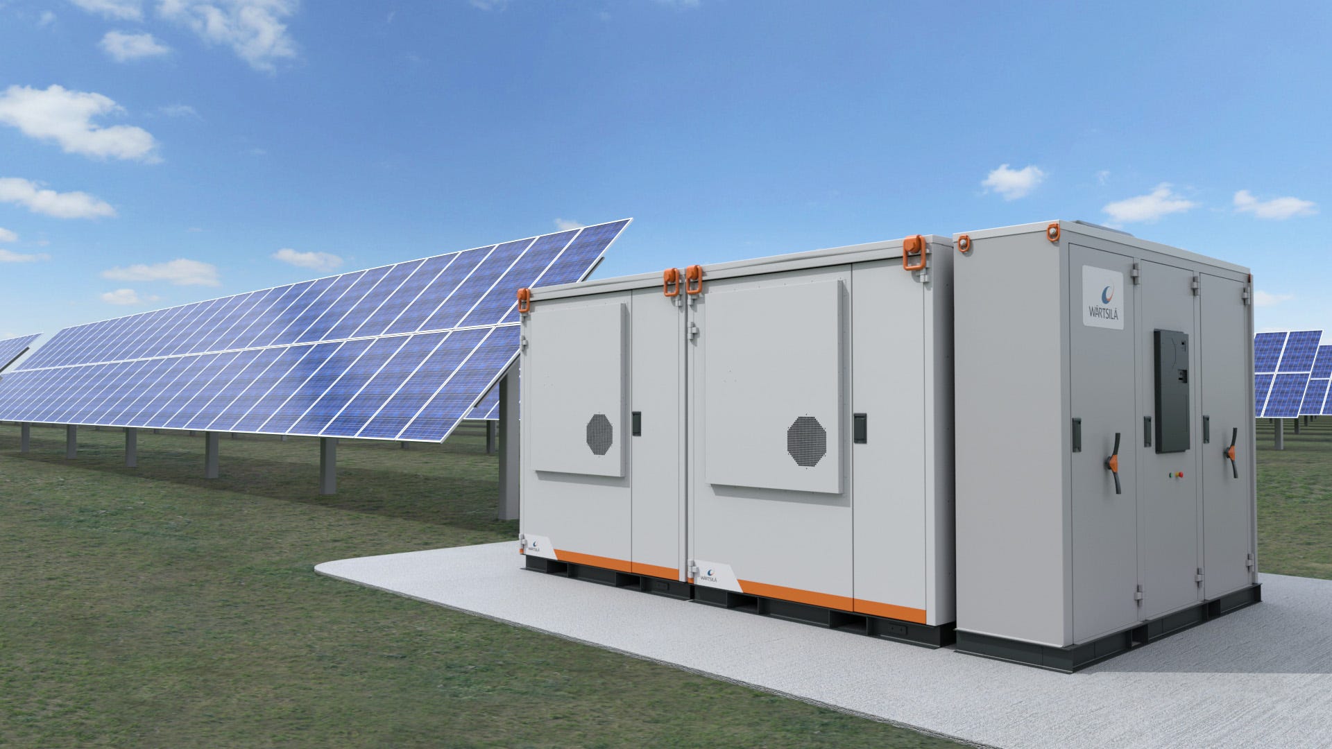
For solar to scale to lofty heights, it will of course be necessary to pair new capacity with battery storage. The Gregor Letter has made the point previously, that as solar costs fall, the cost of whole system investment also falls, even if battery costs are falling more slowly. That’s why pairing battery capacity with new solar (and wind) is becoming more routine. Yes, battery costs remain substantial—even though they too are falling. But the ROI of battery investment is going from strength to strength as owners of that capacity gain not just a single economic edge, but a plurality of edges.
Here, we only need to review the recent round-up to see that battery storage is taking off:
• US battery storage capacity more than tripled in 2021, according to the EIA.
• Batteries are growing so fast, US capacity will advance by 10 times from 2019-2023.
• Battery capacity has grown so much in California, it’s showing up now as dispatchable generation.
If investors in renewable energy were concerned about the interest rate outlook, risk is fading quickly that a higher rate regime is upon us. The yield on the German 10 Year government bond fell dramatically last week, in response to a contraction in Eurozone economic activity, and on the heels of a rate hike from the ECB. The same dynamic is already at play in the US government bond market, which has seen yields falling again at the long end as the Fed maintains its hawkish stance, while housing, manufacturing, and commodity prices fall. Many investors thought the opposite outcome would emerge, with long end yields rising as participants grew to believe a long term inflationary problem was developing. Understandably, long end yields did rise steadily for over eight months as the Fed’s tightening campaign got underway. But as The Gregor Letter suggested previously, they likely peaked right around the June rate hike. Now, those same yields are threatening to break more decisively, back below the 2.8% level, which suggests to traders that the long end price will continue rising, and yields will continue falling. This sets up an inevitable drama: what if the yield on the 10 Year US Treasury bond continues falling, and not only meets but surpasses the Fed Funds rate, which is still rising?

One is reminded of the game of chicken, popularly depicted in films of the 1950’s, when two young men driving separate cars would speed towards each other, seeing who would swerve first. With the Fed Funds rate set to rise by another .75% this week to 2.25%, the long end of the bond market is going to start screaming (if it’s not already) that front end tightening is going to ensure not just the slowdown already evident, but a proper recession (if we aren’t already in one). The question on everybody’s mind: when the Fed sees the yield on the long end yield now coming towards them, bearing down on them with headlights, who is going to swerve first?
What to look for in this week’s FOMC policy statement, and press conference with Chairman Powell: some acknowledgment that the tightening cycle is starting to work. Petrol prices are down, the housing market is under great pressure with mortgage applications and buyer activity falling notably, and even measures of inflation expectations are down, as we saw in the most recent University of Michigan survey. For what it’s worth, after a massive decline in global equity markets, and real trouble (not just feared trouble) brewing in the EU economy, the Fed could actually help itself and its own cause by taking some small credit here for breaking a few pieces of china. By doing so, it would set expectations favorably and frame up their project: see, we said we were going to fight inflation, and we are, and we are going to continue while being encouraged that we’re making progress. Doing so would confirm the intention, that the Fed basically wants Americans to consume less. Less stuff, less travel, less petrol.
Finally, it’s just never that reassuring that the job market remains strong, as a menu of macro data continues to weaken. Job creation typically keeps going even after the first few months of a recession’s beginning. And here is perhaps the most poignant thing to remember about the US economy. Over recent decades, the US has shown a remarkable—and reliable—ability to flip rather quickly from a regime of inflationary pressure, to a disinflationary outcome. The 1970’s model, in which we enter recession but inflation persists frankly seems highly unlikely. And the long end of the US treasury bond market is telling us it agrees with this expectation.
—Gregor Macdonald